McDonald’s, Starbucks, Audi, Nike, Mercedes, Reebok, Whatsapp, Instagram, Twitter, and so on- the logos are enough to define what they serve! How will you make your brand identifiable like these topmost brands? Well, the answer is a catchy and noteworthy LOGO. No matter if there is a change in logo design trends, we can still […]
Updated 21 February 2024
McDonald’s, Starbucks, Audi, Nike, Mercedes, Reebok, Whatsapp, Instagram, Twitter, and so on- the logos are enough to define what they serve!
How will you make your brand identifiable like these topmost brands? Well, the answer is a catchy and noteworthy LOGO.
No matter if there is a change in logo design trends, we can still know what the brand is all about just by looking at the logo. A logo is something that can still be identified without the need to add the brand’s name too.
That is why logo design trends 2020 is one of the crucial parts of the company’s identity. In other words, logo design trends are itself an ongoing important branding asset a business can make.
Here in this blog, we will be discovering why logos are important to top logo design trends and what brands are doing with their logos amid the novel Coronavirus disease.
Let’s begin with why logos are important.
Logos are important because they are the face of an organization. It is the first thing that catches attention before understanding the ideology behind a brand. Also, it is a smart symbolization and a mix of ideology, meaning, and design.
A brand new logo, no doubt is not just an image but a recognition for everyone. Other than that, a logo can mark a presence in the mind of users if being made and presented smartly and nicely. It is the first step towards the foundation of a brand and an image showcasing what kind of business it is.
When this was the basics about a logo, there are 7 topmost reasons to understand the importance of a logo.
It is hard to gain attention these days, firstly, users don’t spend too much time to get convinced, and secondly, there is a lot of competition. The moment you stop making an effort, the same moment, your competitor will make a presence.
Hence, a LOGO with everything perfect can be a showstopper.
Instead of defining what you sell in words, a brand new logo can quickly grab viewers’ attention along with communicating the core values of it too. If everything works as per the plan, a short span of attention is enough to make users look at you soon.
A logo should bring in curiosity too.
The first impression is the last, and when it comes to a brand-new logo- you can only have one chance to make a mark!
Before any formal introduction of a brand, a logo is everything that defines what it is all about.
When positioned rightly with a blend of curiosity and containment, you can achieve the very first phase of your service- User Attention.
As said earlier, before getting started with what your brand is all about, a logo can at least define it in a few words.
Colors, tones, fonts, designing- everything is capable of establishing a link between a brand’s service and ideology. Wherever the logo will be shown will take the lead over the coming introduction of the brand.
As per logo design trends, a logo should remain in the mind of users for the longer run.
When designed with a concept, and pleasing elements- a brand-new logo can trigger positive vibes in the mind of the users. Names can be forgotten, but a well-balanced logo with pleasing elements remains in the mind of the users.
The business serves and showcases differently even when offering the same solution to the users.
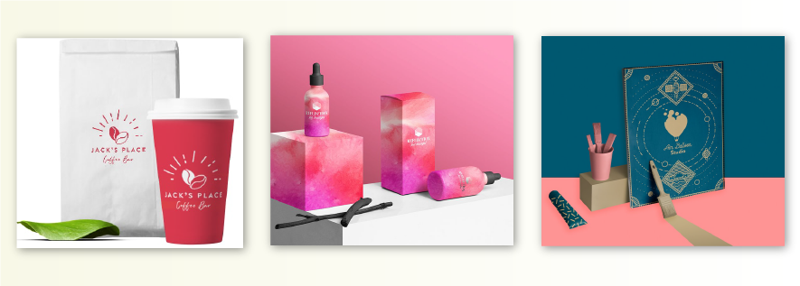
For example- just like you are the top most mobile app development company, your competitor is also developing mobile applications for the client. The difference here can be in terms of Agile Methodology for mobile app development or Waterfall. It can also be in terms of payment structure or any more. Hence, a logo here can define who you are!
A well-designed brand-new logo can reflect a company’s background easily which separates you from your competitor.
Once a brand new logo will grow and become word of mouth among consumers. Slowly and gradually, it will seek trustworthiness from the people around.
For example- when talking about sportswear, brands like Nike, Reebok, and Puma are quite common. This shows the trustworthiness of a brand and an assurance that your money will not be going in vain.
Hence, a logo can bring in the trust of the consumers they can relate with!
Last but not the end when talking about Logo Design trends, a logo is the first thing users communicate with. Hence, it should always be the front, middle, and end of all marketing tactics and promotions.
Hence, a logo should also be given utmost importance just like the service and product being made.
Attending the topic, let us now begin with the next important thing about Logo design trends.

Also known as Lettermarks, Monogram logos are filled with letters- Brand’s initial mostly!
Take for example- NGC, HBO, IBM, and CNN- these are the initials of famous brands around the world. By using just 2 or 3 words, these brands are marking their presence in the mind of the users.
Using the Monogram Logos pattern, it is best to showcase what a brand is offering. Isn’t using NASA better than the National Aeronautics and Space Administration?
Similar to Monogram Logos, Wordmarks or logotypes are a font-based logo. It majorly focuses on a business’s name alone.
When it comes to logo design trends, this kind of logo extremely works well when a company has succinct and a distinct name.
For instance- Brands like Coca-Cola, Google, and Visa are the right example showcasing the use of the Wordmarks pattern. By using the right combination of color, and catchy ideas, a brand’s logo can help in creating strong brand recognition.
Next in brand design trends 2020, Pictorial Marks or logo symbols take the place. These logos are shown through an icon or a graphic-based logo.
Tech giant Apple’s brand logo and Twitter’s bird are a few examples. Here, the icons are so emblematic that they are easily recognizable and memorable. This is the reason, Pictorial marks are not easy to be nailed for startups.
When talking about logo design trends, the next in the league is Abstract logo marks. The abstract logo mark is a particular type of pictorial logo. Rather than using a recognizable image, the Abstract logo is of geometric forms representing the business.
Pepsi, Adidas, and BP are a few examples of Abstract logo marks. Also, instead of using an icon or an image, it is better to create some unique kind of logo that represents the brand.
After Abstract logo marks in logo design trends, Mascot logos involve illustrated characters. Many a time, colorful, and sometimes toon-like characters, and mostly fun, mascot logos are considered the best way to create the brand’s spokesperson.
Just like top mobile app UI design trends, these mascots can be shown as the ambassador for the business. The very well-known mascot of KFC is no doubt a famous one. Also, mascots are seen as the best option when it comes to connecting with families and children to a large extent.
Talking about logo trends, Combination marks own the place uniquely. A combination mark as the name suggests is a smart pick of a wordmark or lettermark along with a pictorial mark, abstract mark, or a mascot.
Here, the picture and text have been placed either side by side, placed on top of each other, or merged for creating the final image.
Take for example famous brands like Burger King, Lacoste, and Doritos.
With the change in logo design trends, Emblem is seen as the last but not the least option. Emblem logos are filled with fonts inside an icon or a symbol.
The emblem logo revolves around the traditional appearance which is capable of making a striking impact. This is the reason, emblem logos are often picked for organizations, schools, and government agencies.
Take for example- Starbucks, and Harley Davidson.
When we talk about logo design trends, a logo is often shown with typographic elements. Typography includes letters seen in the logo that are arranged in a kind of consistent design. It includes single letters, monograms, or many times the full name of the brand.
Typography most of the time is accompanied by icons, symbols, or imagery. The symbols and icons can also be used as per the services being provided to the users.
Other than common colors, a logo can be made using black & white, monochrome, or multicolored. Colors are something that shows the nature of your business. For example- a color can showcase whether the services you are offering are playful or serious, innovative or wholesome, timeless, or stable.
Often placed under a logo, a tagline comprises either a sentence or catchphrase made for hooking the audience while showcasing a company’s ideology.
Meanwhile, it is not necessary to make logos accompanied by a tagline but it can still be considered. But still, a tagline can communicate the value of the brand.
Next in logo design trends is context. It is mandatory to know when and where logos should be placed.
Context can usually be used for portraying brands online, on business cards, and in advertising along with prints.
Don’t overcomplicate your brand design. Similar to the UI design of an application, the design of the brand logo should be easy, simple, and clean.
Check out how much it cost to design a mobile app
To make your brand logo easily recognizable, it is meant to be simple. It is one of the fastest ways to make the logo memorable, noticeable, and easily rememberable in the mind of the audience.
Hence, the logo design should be made simple with a simplistic color scheme and design.
In the cut-throat competition, it is important to make the brand emerge better or at least similar to the competition.
Also, it is quite challenging to make a mark in the presence of an old hat competition. Without paying attention to distinct logo design, it will be hard for users as well as for clients to recognize the urban with the pre-existing ones. And there might arise a chance that instead of choosing yours, your potential consumers choose your competitor.
Hence, a logo design should be distinct.
As per different mediums, a logo design should be designed precisely without losing its originality, uniqueness, and power. Also, a great logo should work accordingly on the web, letterhead, print ads, and in the video too.
Hence, for a good brand logo design when we talk about logo design trends, it is mandatory to look for the versatility factor.
One of the logo trends to avoid when designing a logo is to ensure that is appropriate too. Take for example- McDonald’s. Instead of placing a juicy burger and fries, the brand opted for its first initial “M” and created an icon- simple and visually appealing.
When designing a brand-new logo, ensure you are communicating the righteousness of the brand’s ideology.
A brand new logo you are designing should also be targeting your potential customers too. Just like the brand’s ideology, it is also important to connect logos to the people around them. It should be speaking to the target audience too.
It is challenging to design a logo that is not just targeted but memorable too. But if a brand new logo is made, it will be of great importance.
A good amount of time should be given to the designing of a logo while looking at logo design trends too to create a memorable logo.
Instead of making logo design too trendy as per the changing logo design trends, it is better to invest a good time in one-time effectiveness.
Not just a brand new logo but a logo, all in all, should be made for long-lastingness.
When this was about design in logo trends, there are a few important logo design trends to have a look at.

The very first logo design trend to know about is simplification. It is essential to remove extra details while making the design using a minimalist approach. A brand-new logo should be easily recognizable to strengthen the branding value.
Instead of using old logo design trends like circles and squares, one can get started with unique geometric designing compositions.
Material design VS flat design is stealing the show today, hence, it is quite obvious to see the reflection in logo design trends too.
Similarly, there can still be a mix of familiar fonts together in another unique and custom-like design. This will help in making a brand a little different and unique as compared to other brand logo designs.
Yes, cluttering is one of the logo design trends of 2020. Cluttering can help create motion and depth in a flat design. Overlapping, different shapes, and colors can be used for this purpose.
Colors are the essence of a brand logo design. Keeping the same thought in mind, gradients are now being used as the next logo design trend.
Designers today are experimenting with logo designing by hiding the meaning behind the design itself. It is like giving a chance to users to figure out the meaning itself.
To validate the above-mentioned points, here is the evolution of logo design trends that happened!
Red symbolizes passion, anger, and excitement. The color is suitable for a loud, playful, young brand image.
White is the color of purity, sophistication, and efficiency and it can deliver a clean, simple background for a logo. Those brands who want to convey a luxurious presence to it can opt for this.
Yellow is a warm color that showcases friendliness and cheer. It also symbolizes youthful energy.
It is the more playful and yellow’s energetic cousin. Orange is a suitable option for brands looking to showcase and elicit feelings of vitality and happiness.
For brands that want to showcase sophistication and royalty. The color can be an opt choice for cosmetic brands.
It is a restful color without making eye adjustments. The color showcases a sense of balance and calm connecting nature also.
Blue inspired a sense of calmness and spiritual awareness. It brings trust and is a suitable choice for the healthcare and medical domain. It brings calmness and healing to the mind and soul.
Brown represents seriousness. Brands like to show a sense of quietness, supportiveness, and reliability.
Pink is considered a feminine color, it retains a sense of energy and cheerfulness.
Gray is a neutral color and is considered to show timeless, practicality, and unbiased feeling.
Black is in trend these days. Black is seen as a symbol of professionalism and seriousness. It shows elegance, substance, and power.
Gestalt’s first principle Figure-ground showcases that we can perceive objects and things either from the foreground or background.
The principle can help in designing the logo either from the foreground or background. It can make the brand bring curiosity to the users and clients.

The next logo design trend, the Gestalt principle can help in is Similarity. Things that appear similar to each other should be placed together either in place or in a group.
The similarity principle helps in designing the logo by placing almost similar things in a group. It can be used for showcasing the brand’s ideology and its design either in a group or in a place.

When talking about logos design trends, the third principle showcases that things that are closer to each other appear more related when compared to things placed from afar.

This principle of Proximity can be made useful by placing the mascots and geometrical figures together and the tagline behind them.
Next in the line of the Gestalt principle is a common region. This shows that objects that are placed in the closed region are seen as grouped.

This can be used for making logo design trends by clubbing the most essential thighs together of a brand’s major identity.
The principles highlight elements that are placed on a curve or in a line are considered more related than those elements not arranged on a curve or line.

This principle can be used for making a brand new logo continuous by placing the core of brand ideology in a curve or line.
Closure highlights that when looking at the complex placement of visual elements, we considered seeking a single recognizable pattern.

The example of IBM is enough to make you understand how this principle can be used when designing a brand-new logo.
Whatever stands out of the box will always take the attention of the users and will remain memorable.

You can use it for showing the core ideology of your brand uniquely.
Brands are fiercely fighting the Coronavirus disease by motivating people to follow the rules and measures required. Apart from donating a huge amount, promising to serve essential services, and offering the support to make required kits and other things to fight coronavirus disease, brands are using the best of their skills.
Have a look-
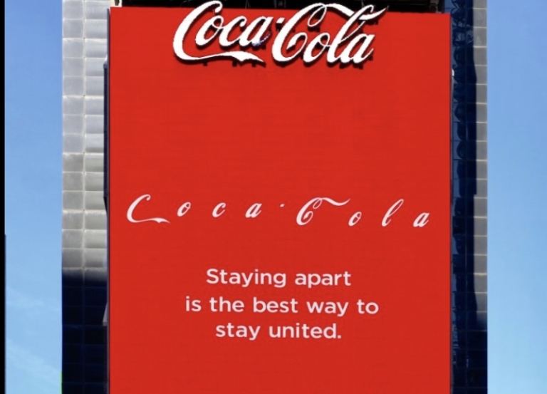
The soft drink giant has nailed the art. The brand is also showing the importance of social distancing while highlighting why it matters.
The well-known automobile brand highlighted why it matters to keep distance amid COVID-19. The need of the hour is social distancing and other precautionary measures.
The sports brand is also encouraging people to follow social distancing to protect society as a whole.
And more brands are fiving their bit to the cause- COVID-19.
Amid all-
Appventurez, being the top mobile app development company with its team of expert developers and designers can help you in this pandemic situation by redesigning your logo too.
Our expert team of designers will assist you in the overall design process while offering you suggestions regarding the same.
We just don’t develop mobile applications, we MAKE BRANDS!
Connect with us today!


Elevate your journey and empower your choices with our insightful guidance.
You’re just one step away from turning your idea into a global product.
Everything begins with a simple conversation.